As a design exercise, I challenged myself to conceptualize an ad campaign featuring a pen that my sister designed.
I was inspired by Apple's minimalist yet bold marketing aesthetic while conceptualizing and laying out each frame.
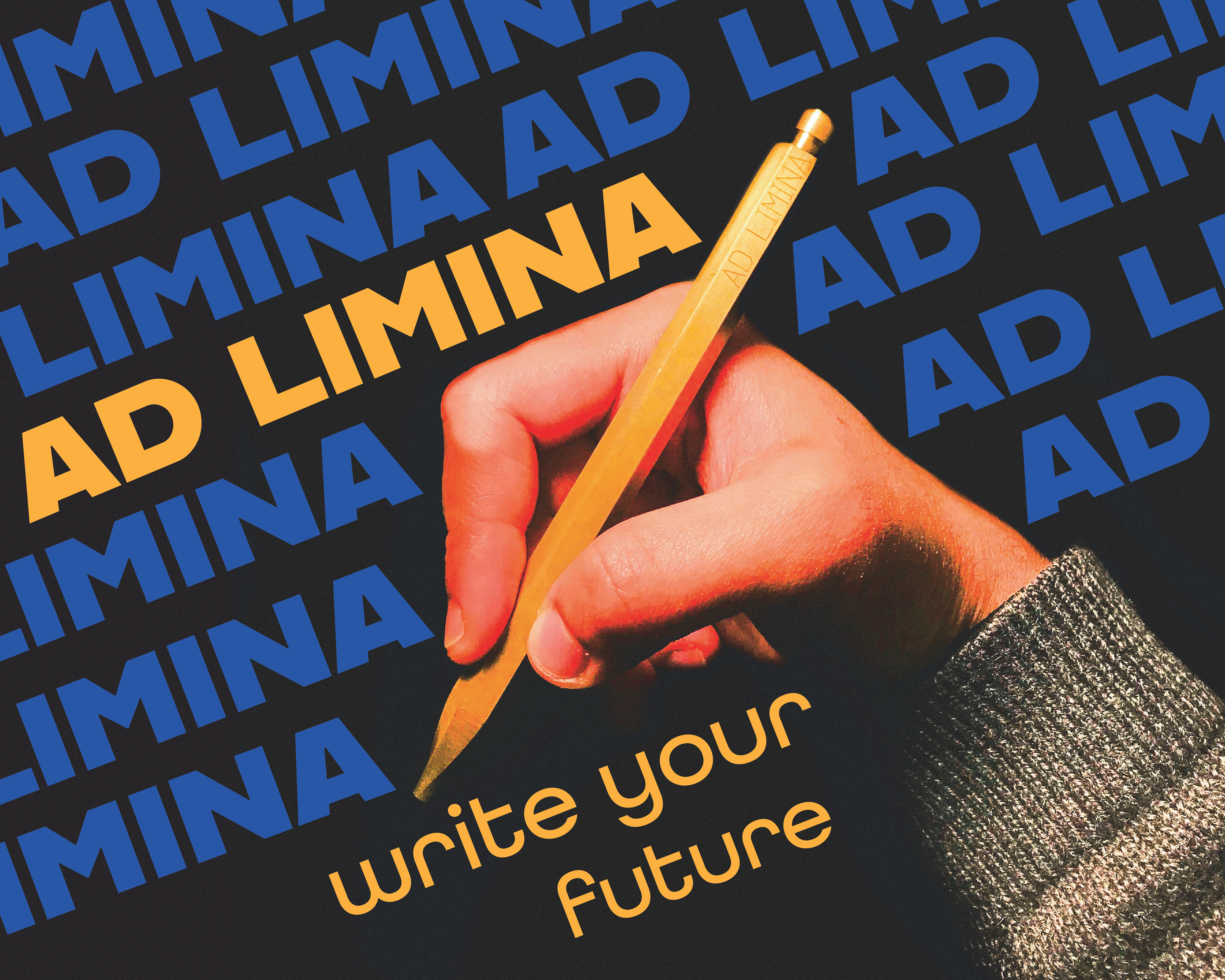
Front of the Campaign
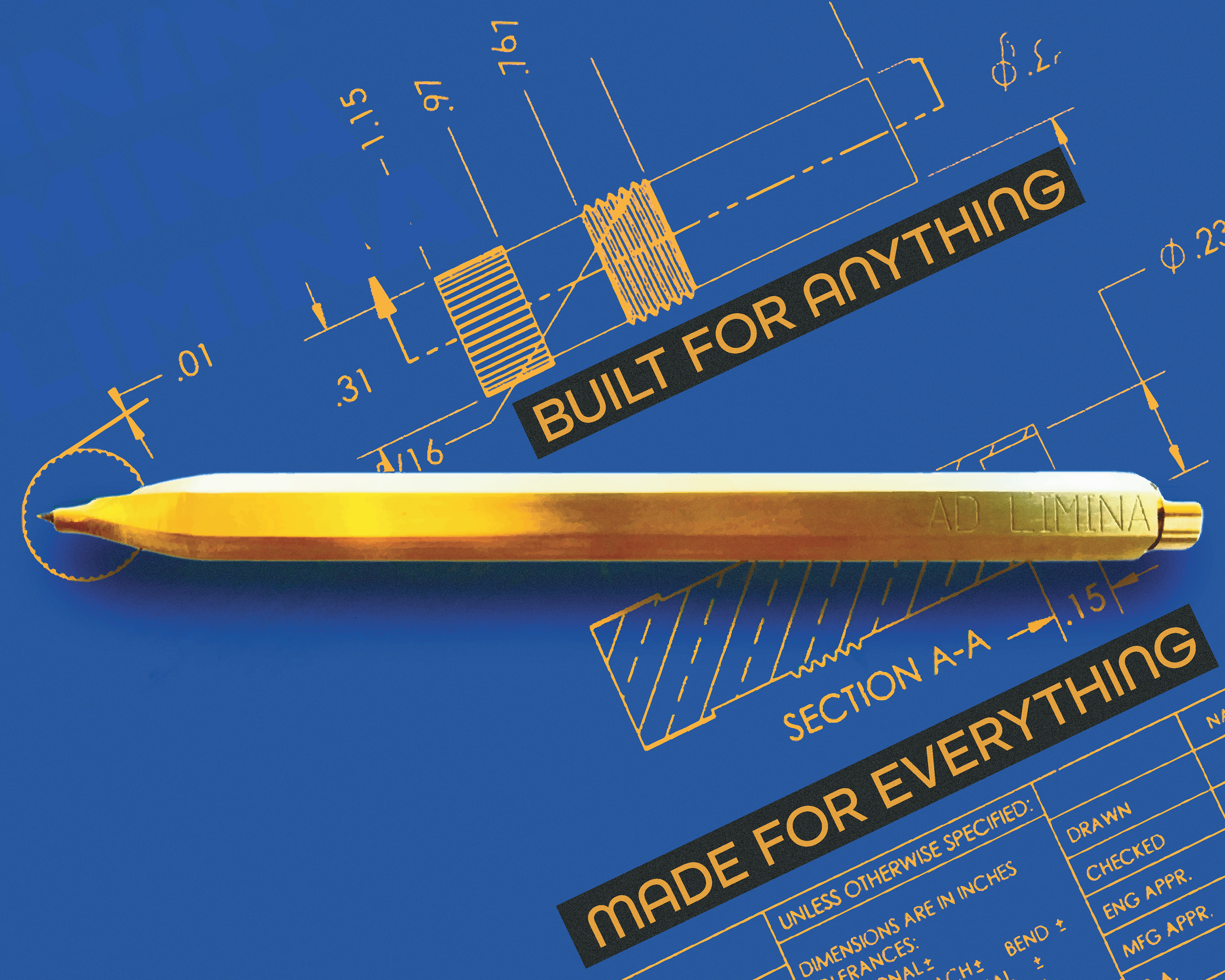
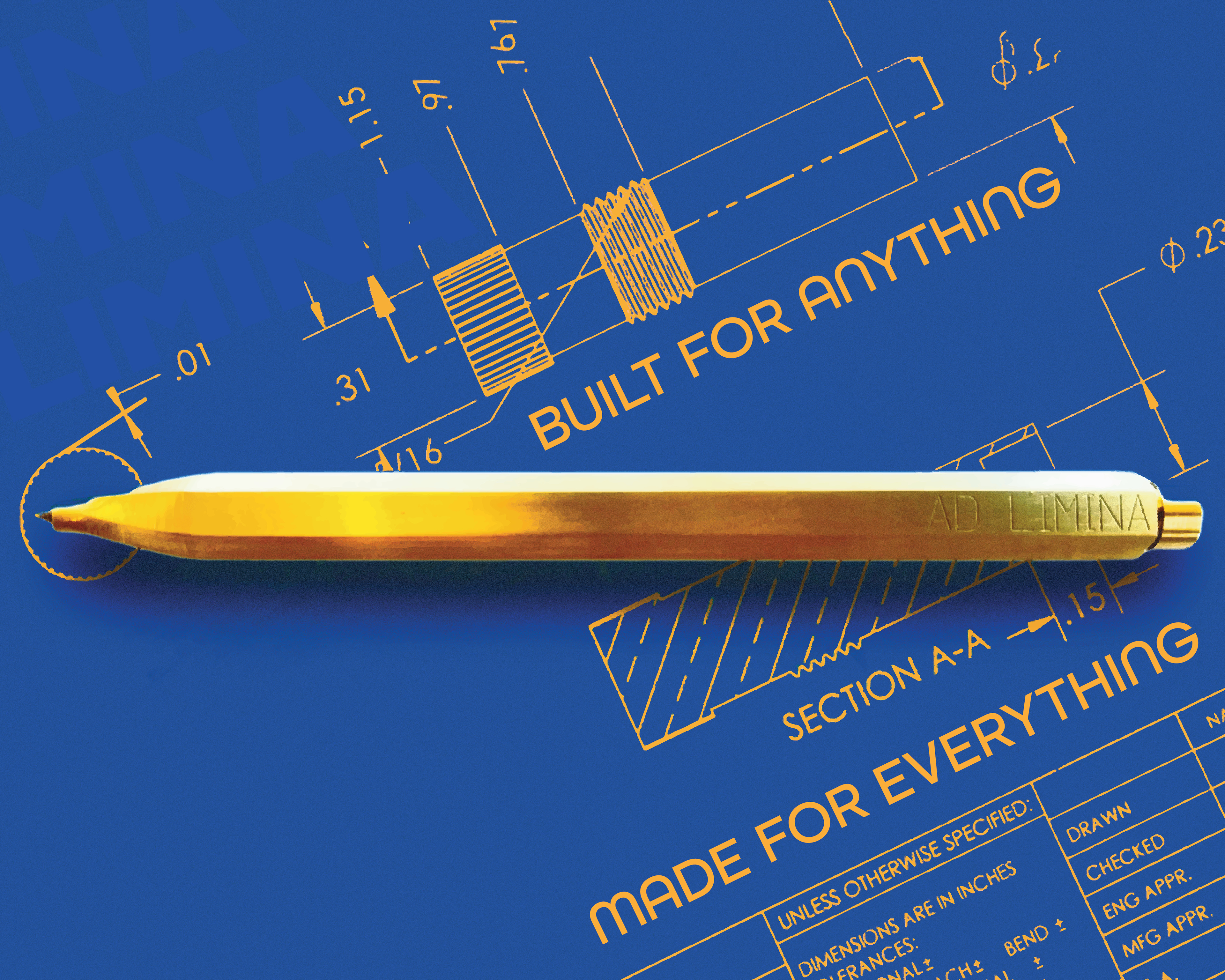
Highlighted Flat Lay
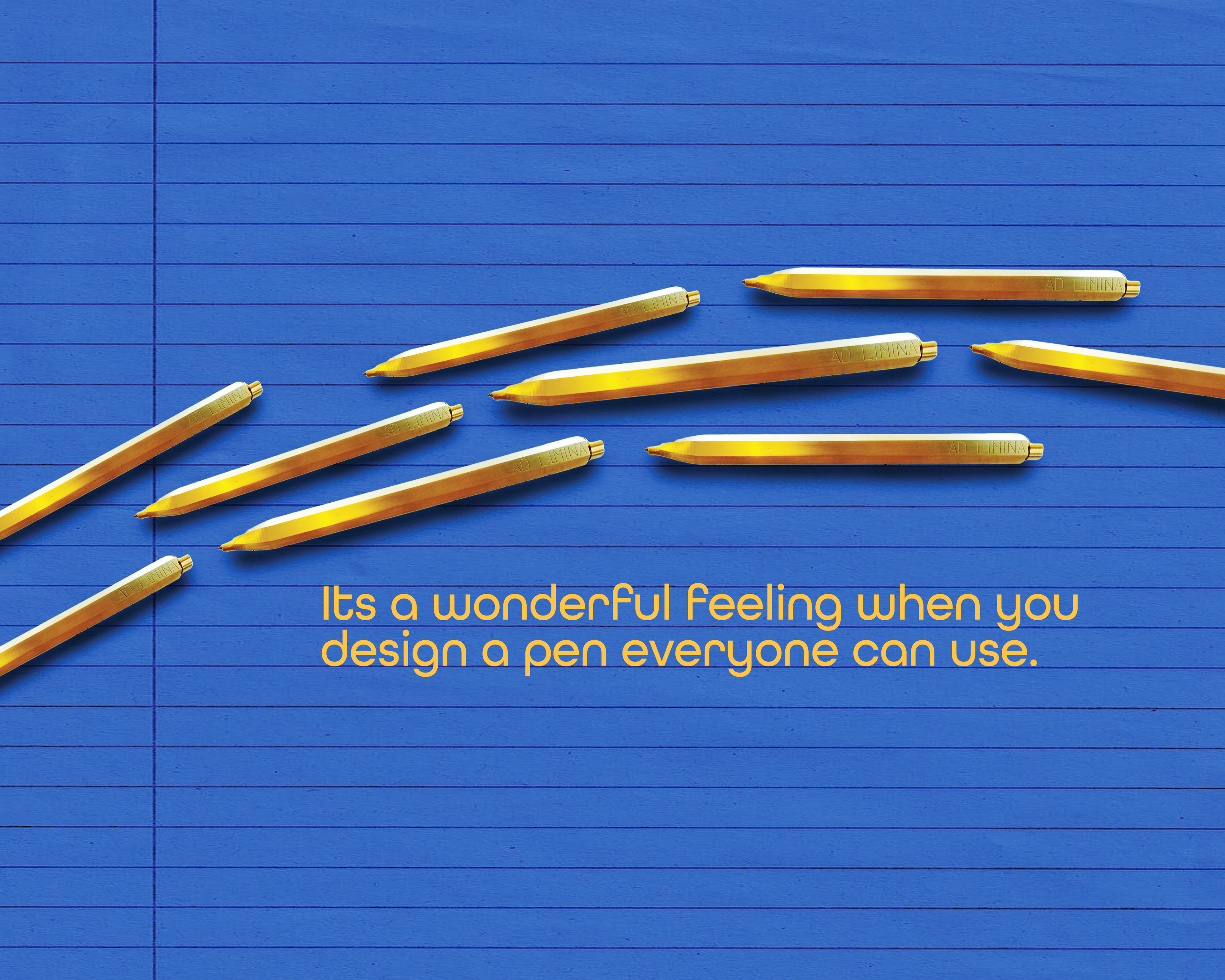
Seamless Flat Lay
I wanted to design these ads keeping the utilitarian and minimalist aesthetic of the pen, so I limited my color palette to draw attention to the form of the pen itself. Drawing inspiration from the bold style of Apple's marketing, I wanted to elevate this pen on a similar plane.
To highlight the product's chunky body, I chose a blocky font and matched the font color with the pen before choosing a rounded secondary font for the descriptions as a contrast.

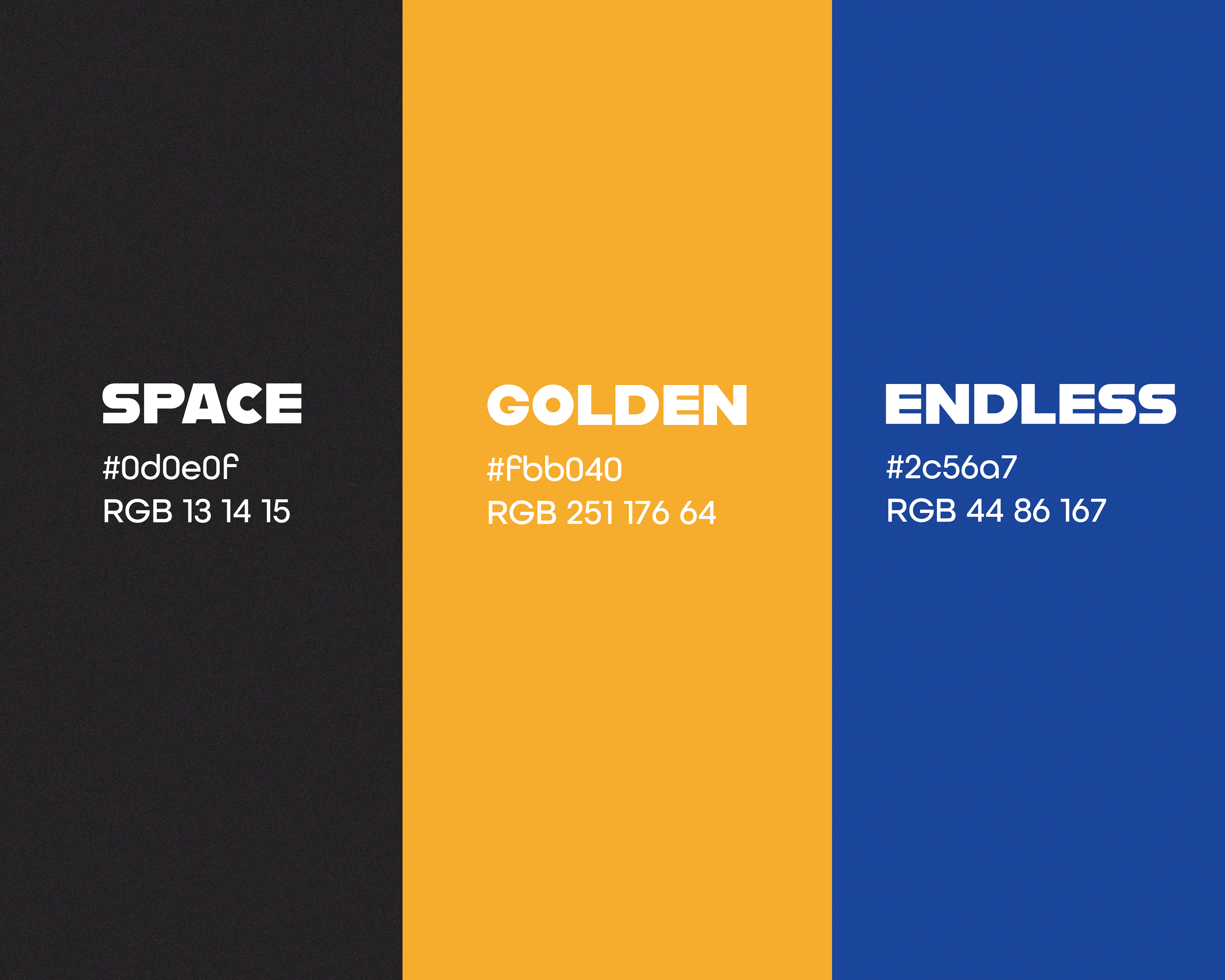
Color Palette
By the end, I had sought to create a campaign that elevated Ad Limina to the level of an Apple product. To market the pen in such a way that it would compare to the sophistication and boldness of any tech product.
Designed using Adobe Photoshop and Illustrator